As good as it gets
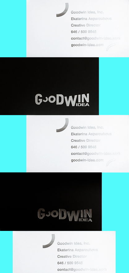
I find it unusually difficult to create a logo for myself or any of my close friends, often due to the pressure of performing a typically professional act for a very personal connection. It is exceedingly hard to step back in this case and view the task objectively through the company lens without considering the person behind it. Luckily, I managed to switch my mind to client design mode by focusing on the company itself, to create exactly what I needed—a simple monotone logotype with a bold, contemporary-feeling that would be communicated well in all sizes and mediums. The idea was to stay away from typical artistic references to achieve more originality than the obvious “I am an artist” identity. Therefore, clean lines, dynamic shapes, a bold appearance and emphasis on simplicity were my winning cards in this game.
CREATIVE & DESIGN:
Ekaterina Asparouhova


