ROYAL IMPORTS
Brand Identity

Brand Identity
Royal Imports has established a great reputation as a well-known company with a long history.
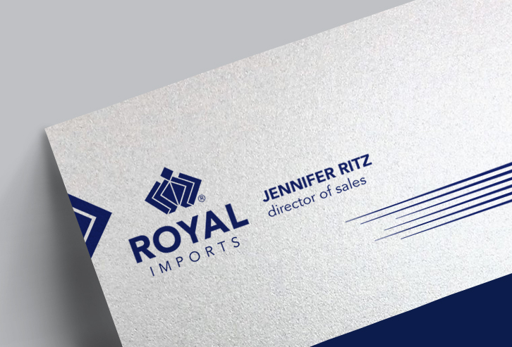
The previous company identity was created many years ago when the company was originally launched. The executive leadership of the company sought to update its identity and brand, starting with the company logo, in order continue to attract customers and keep up with contemporary visual standards.

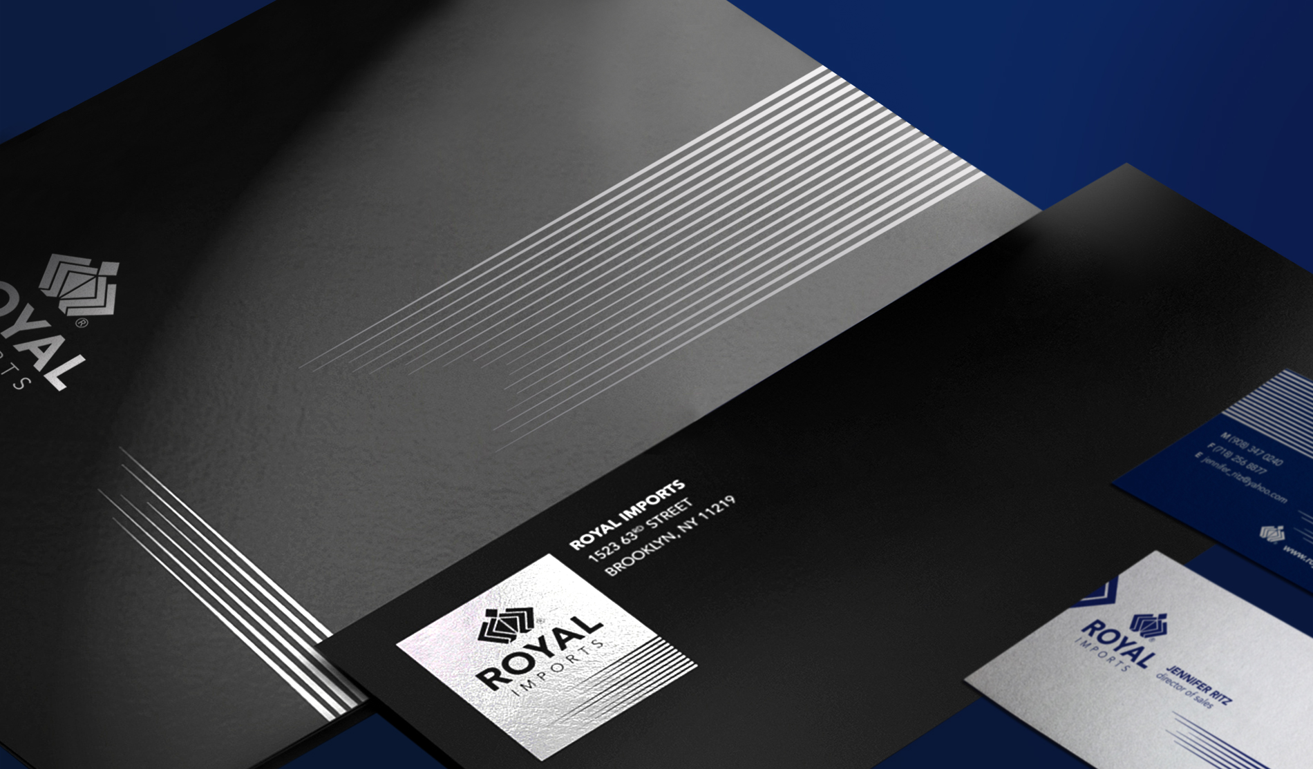
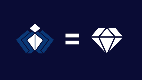
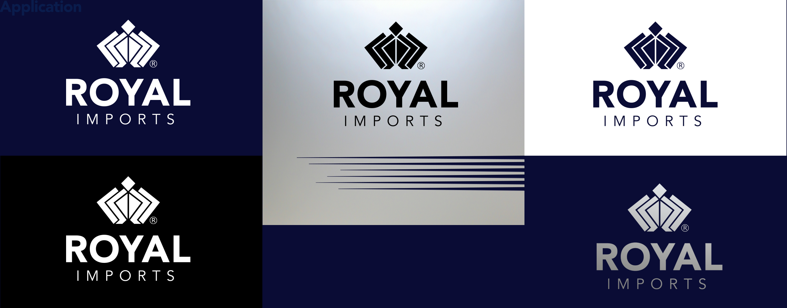
I began with the current logo – a modified crown. The client wanted to continue to have a crown element in the logo not only for its relation to the company’s name, but because of existing customer familiarity with they company symbol. To achieve an updated version, I created a contemporary, stylistically clean and simple crown icon. Its shape and parts of the shape have been extended to all company materials.


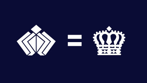


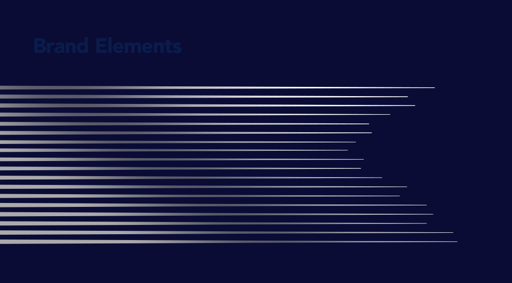
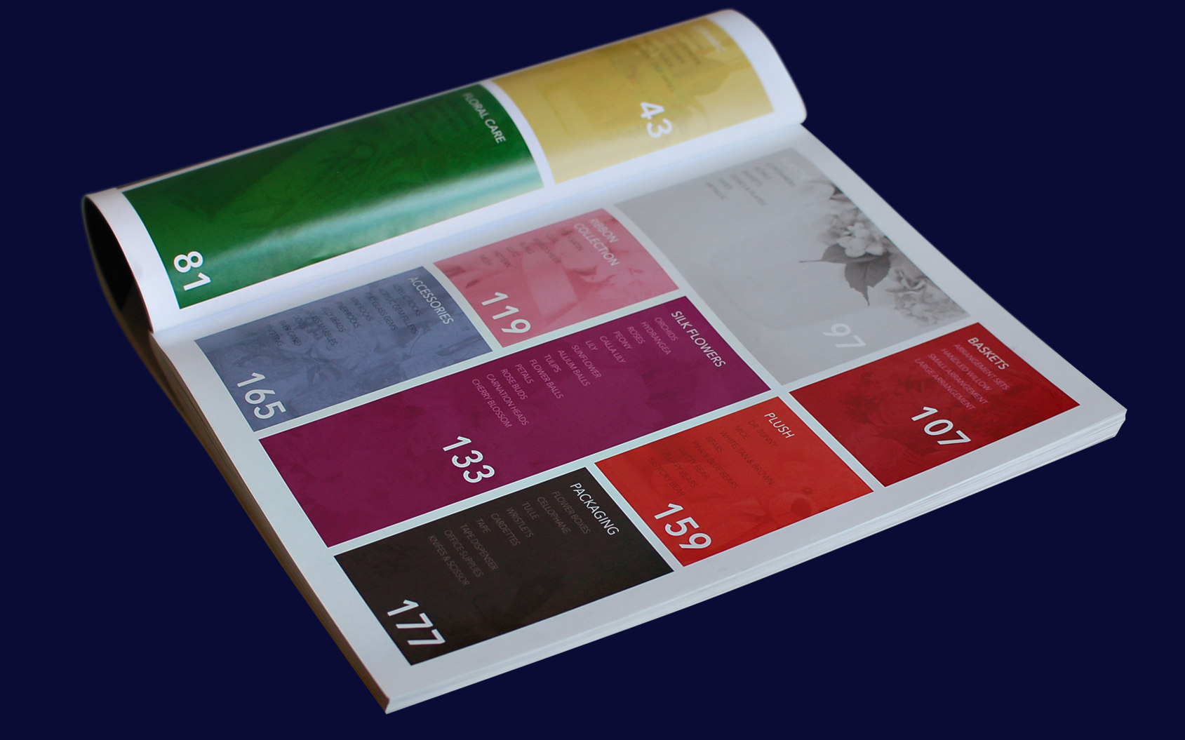
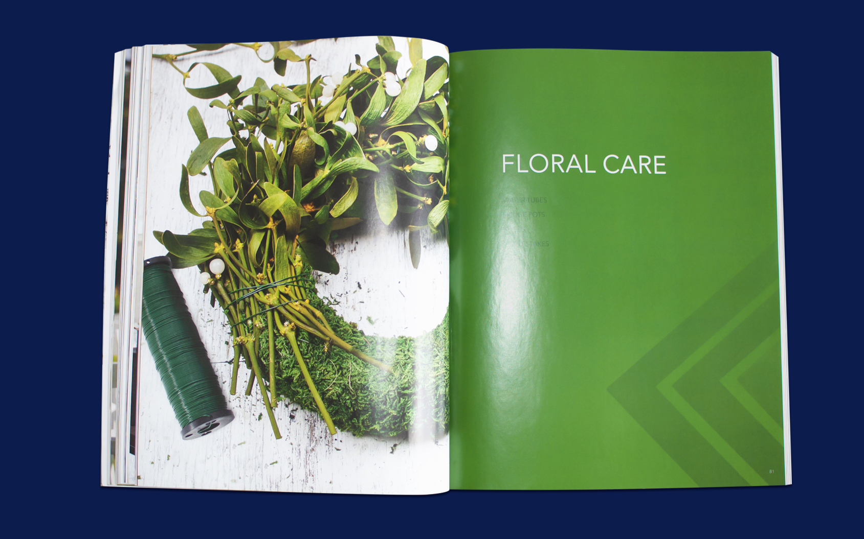
The elements selection was inspired by the idea of fast-growing business, dynamics and development. The sharp triangle edges are shaped around logo’s silhouette and customized for each different occasion: seasons change, topic, type of sales/marketing material, etc.. The colors besides the main ones varies accordingly to the flourish (literally and figuratively), “colorful” business of the company.

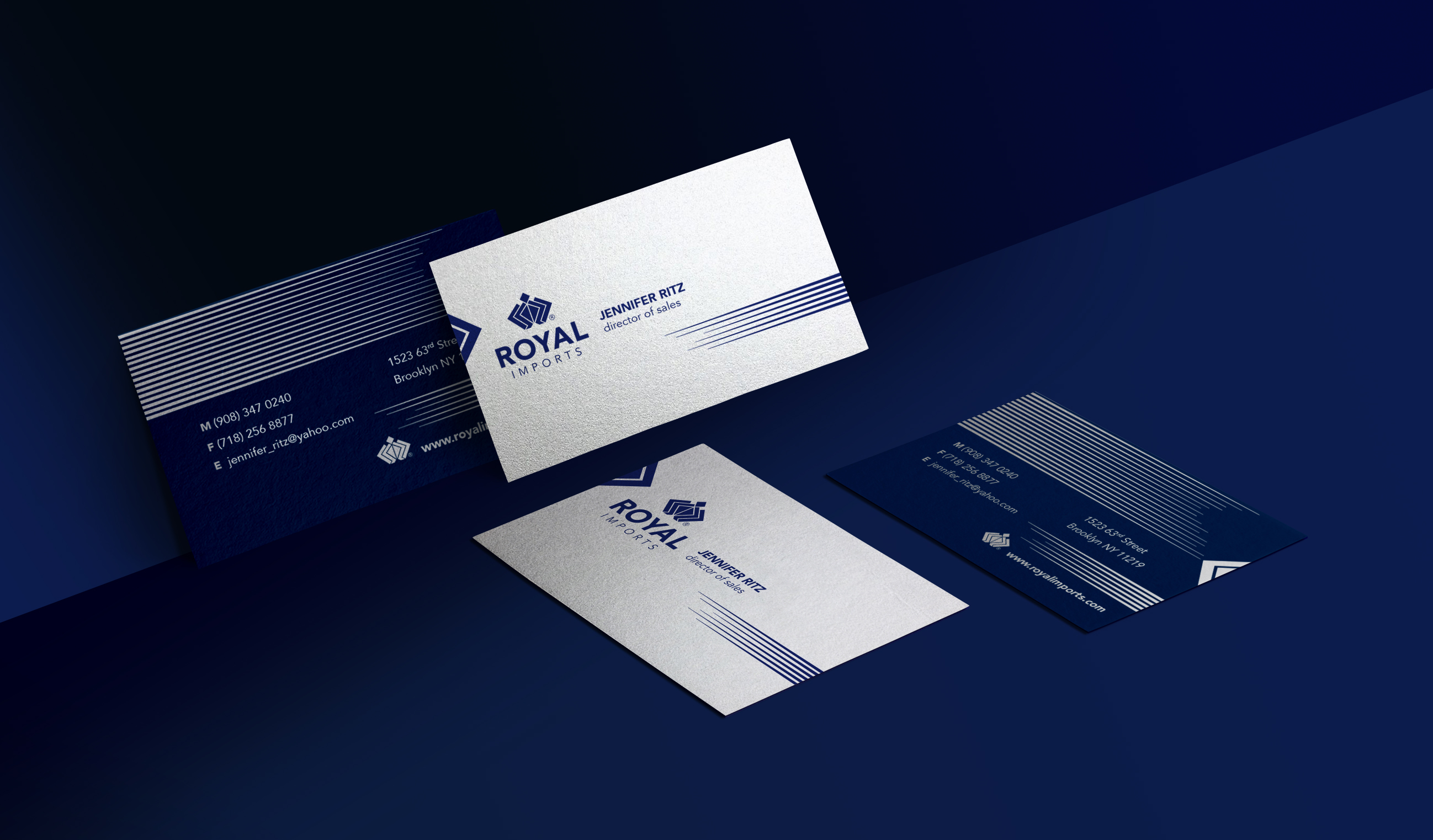
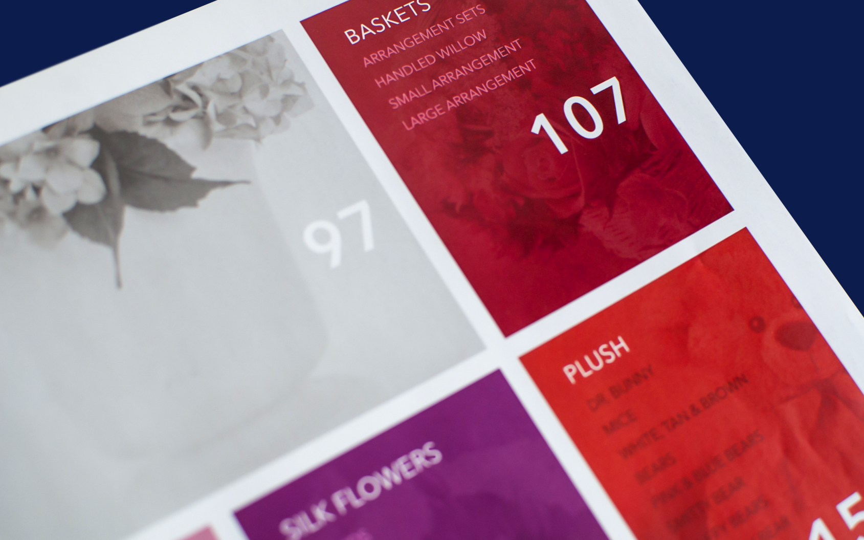
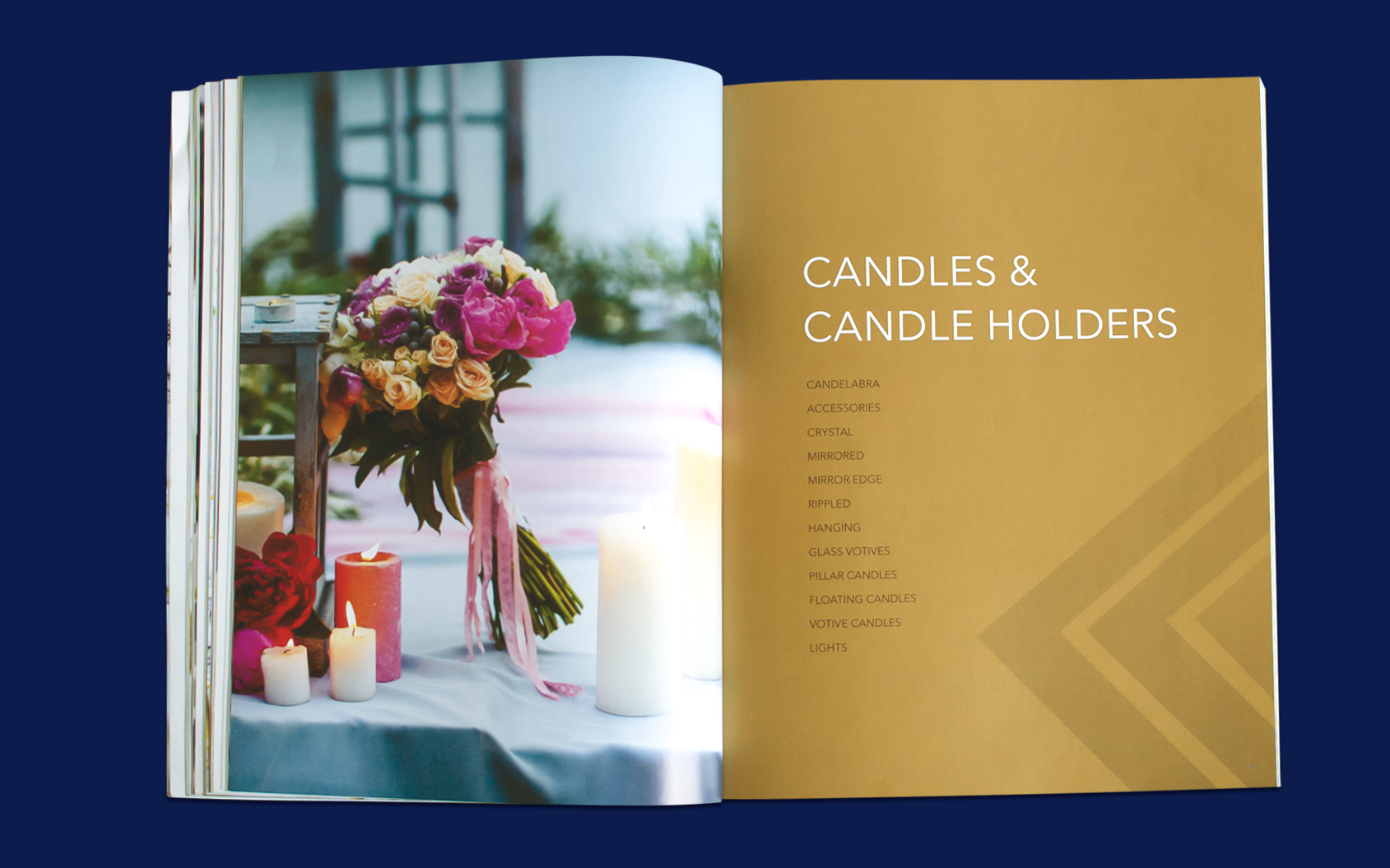
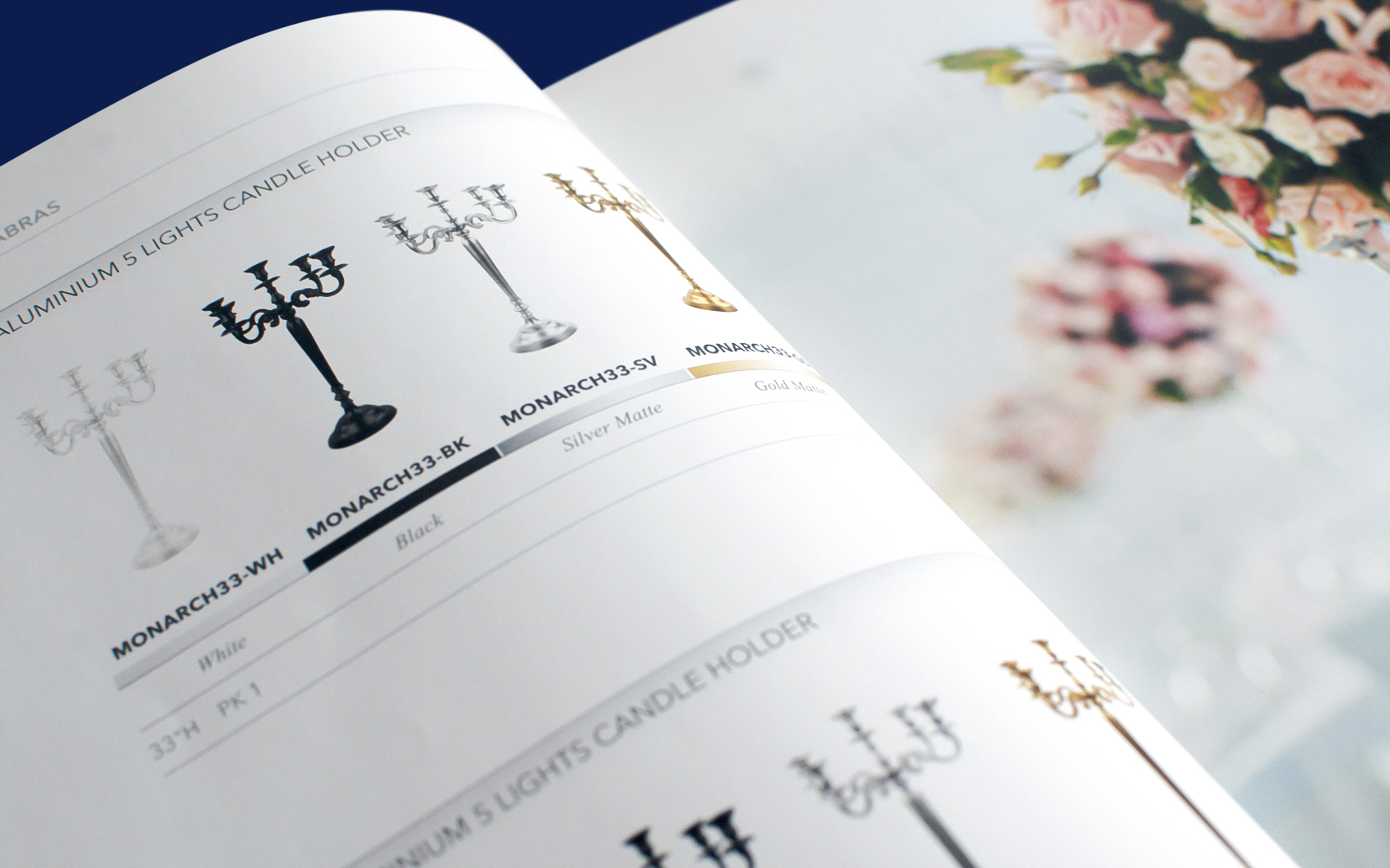
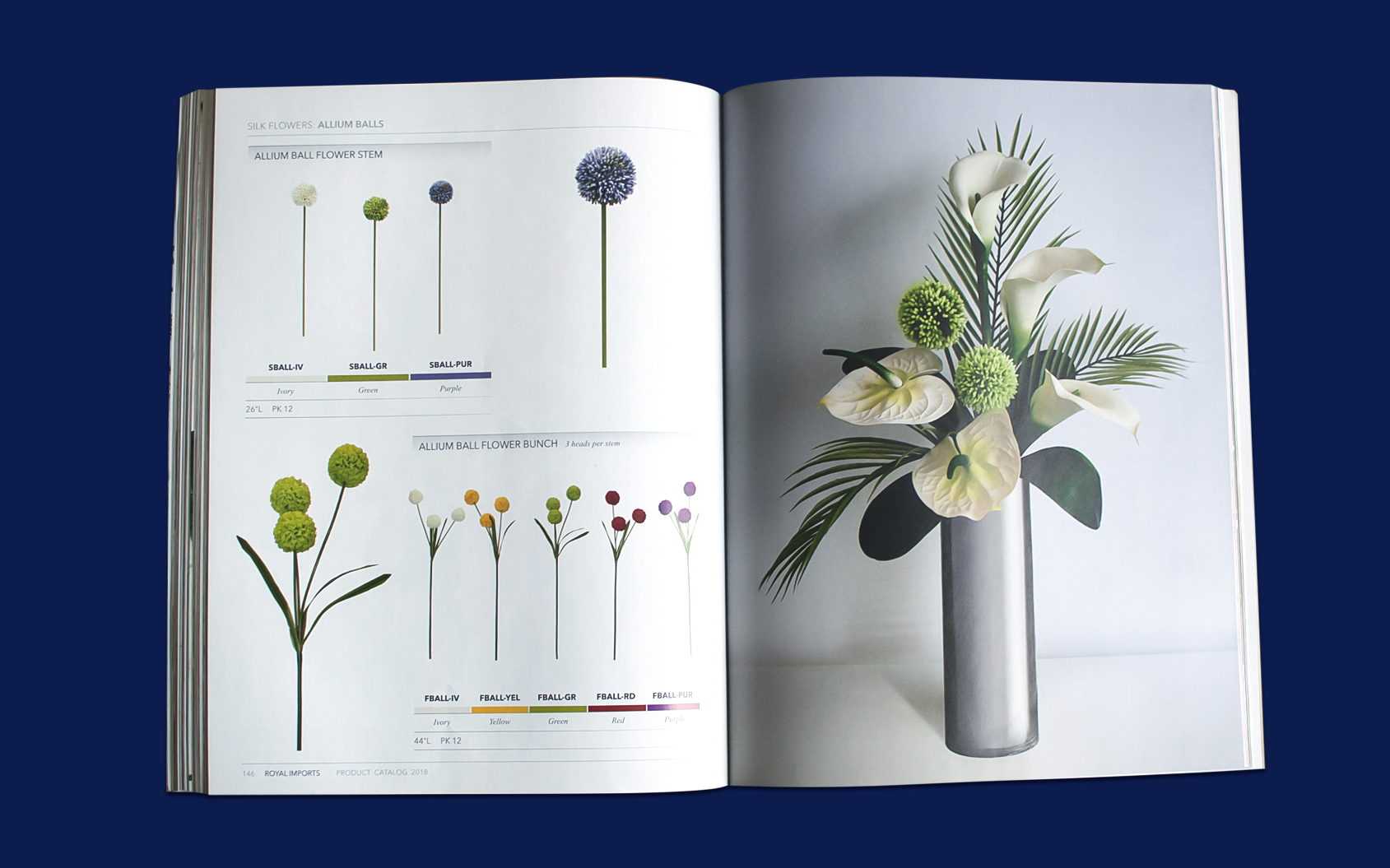
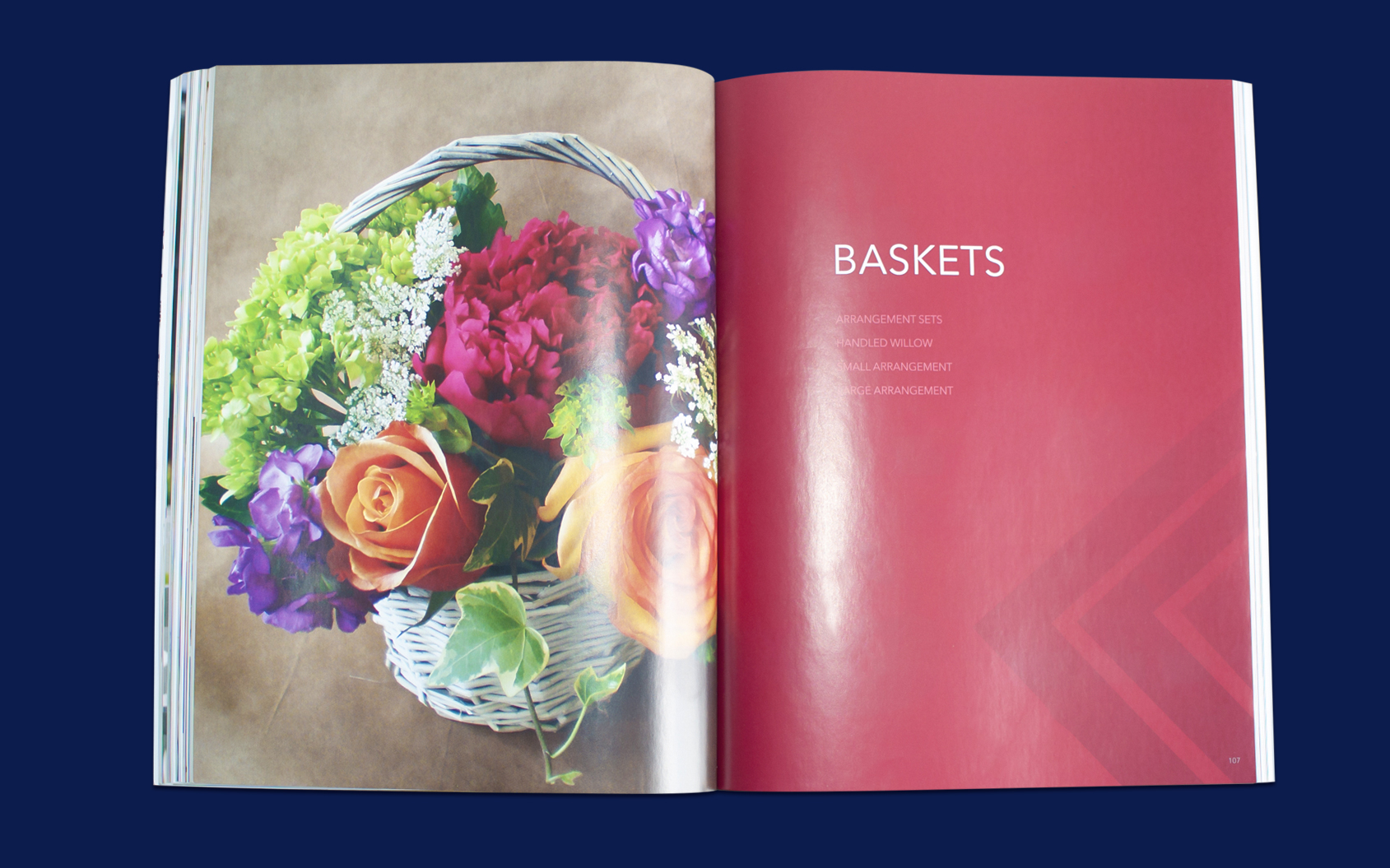
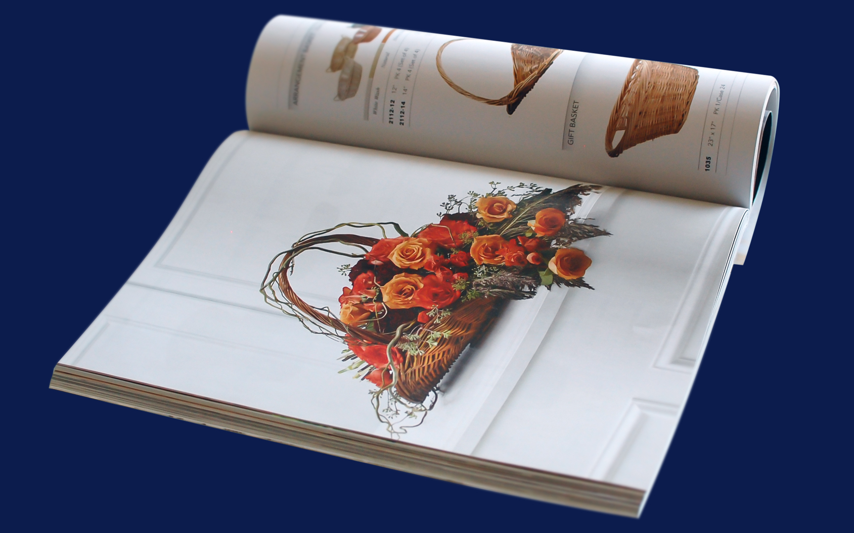
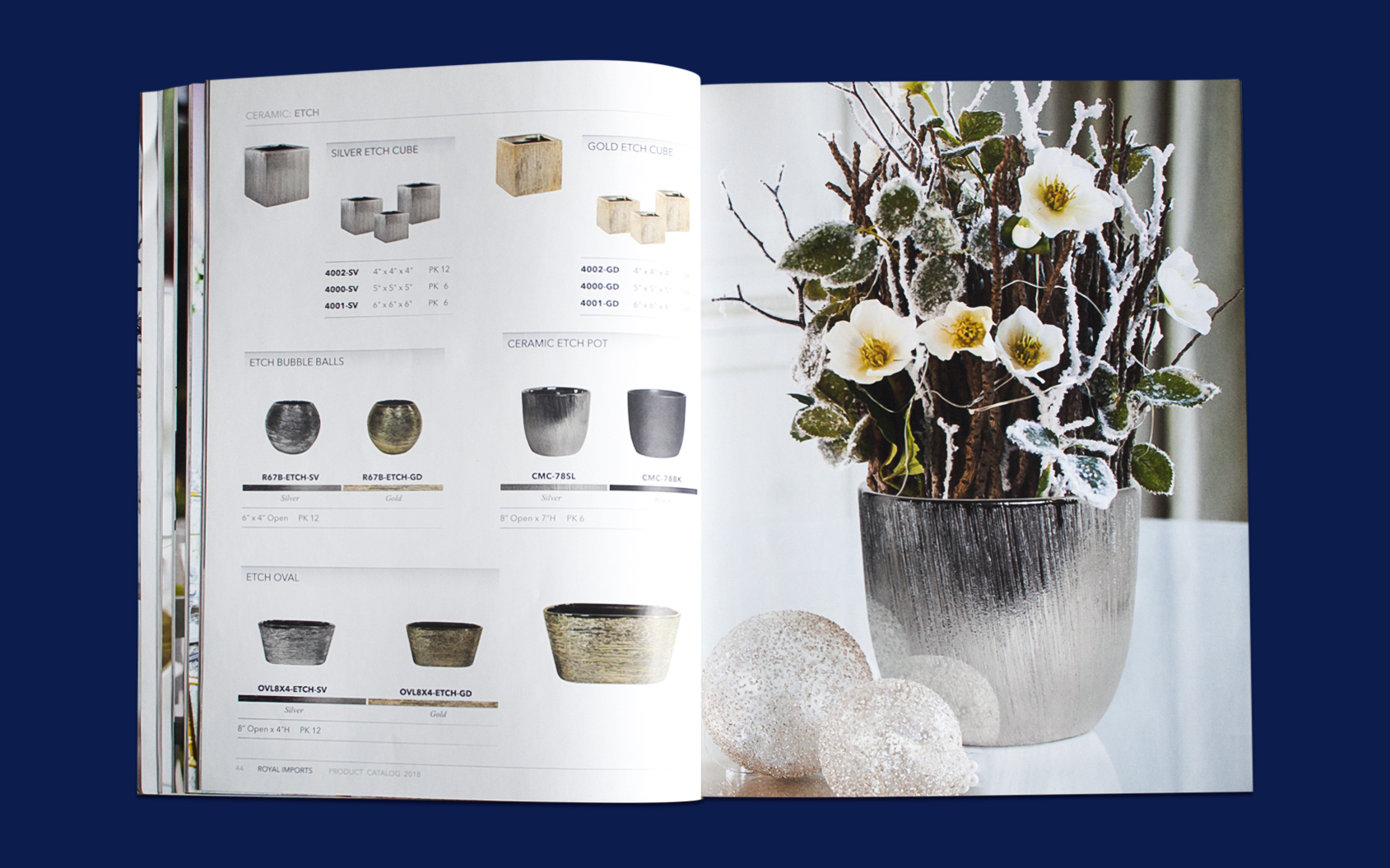
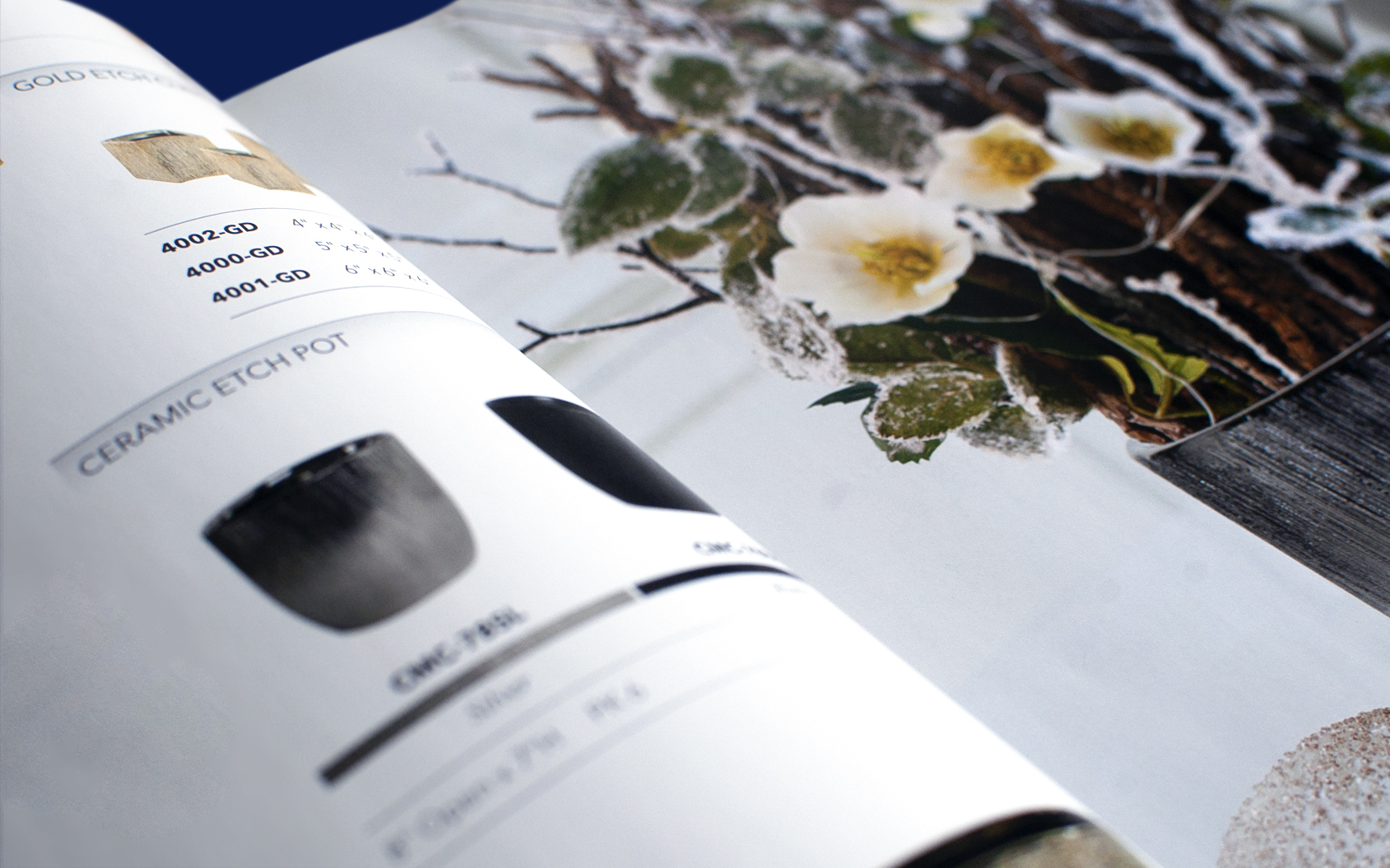
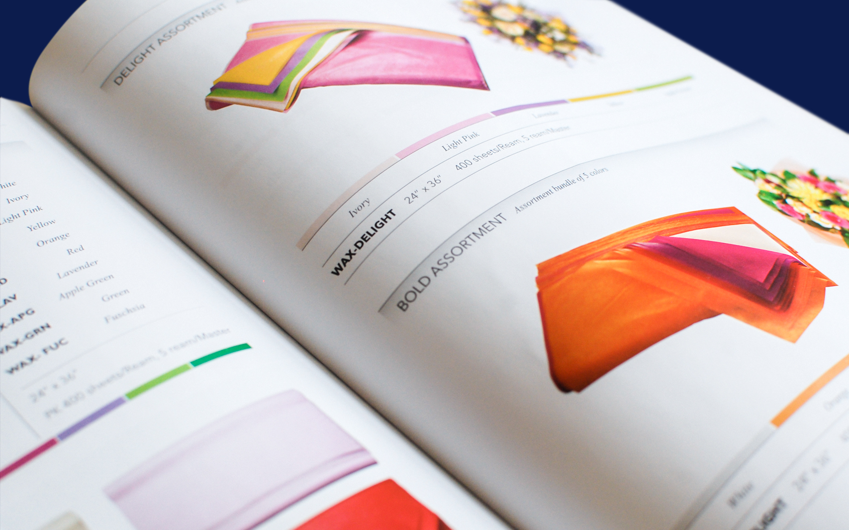
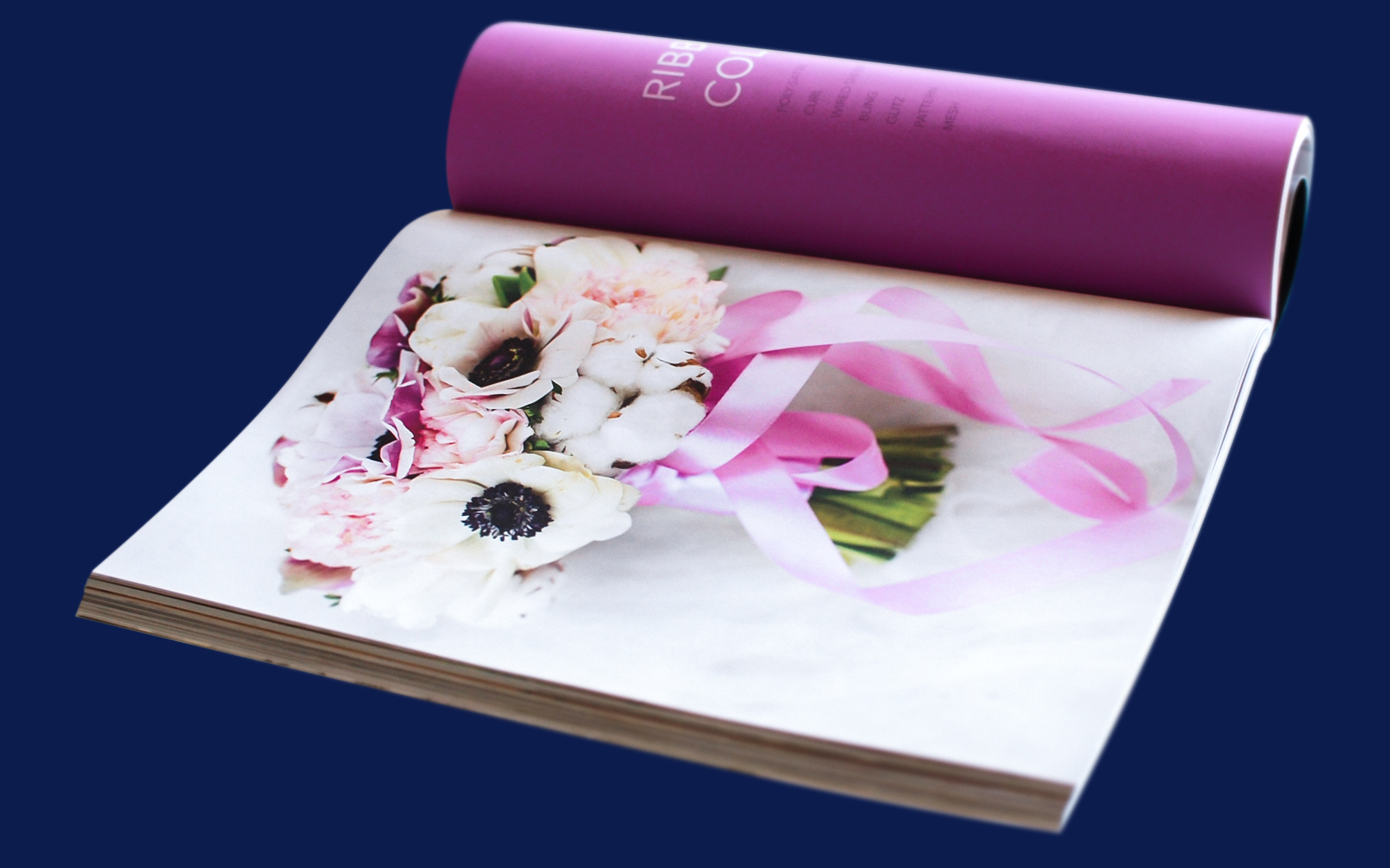
The project included creation of numerous sales and marketing materials including stationary, sales catalogs, brochures, booklets, flyers, magazine advertisement, website hero images and banners, packaging, product manuals, labels, apparel, and expo booth development.
